Wednesday 6 November 2013

Final photoshoot


 My final piece inspired by the beauty reflecting from whats in the inside out. I used flowers throughout the concept of "Identity" because it was something that I could use as a symbol of what I felt could look and represent someone. "Beauty is in the eyes of the beholder" this was something i wanted the shoot to come across as. I wanted to look at a way that identifying a person could be seen past there looks and more into depth with the person that you see before the "face" Using props in my shoot of flowers I wanted it to seem as if all the ways she had been identified before was rising out of her transforming her into what she really is . She is slowly moulding into this beautiful piece which explains my idea of using the head piece to cover her face. She's a new person ,more than what society had recognised to be seen as "identity" she is  more than just her looks if you look deeper inside out.

Preview of Final Piece

Fig 1.Authors own-Side profile of garment

fig 2. Authors own- Back view final piece

fig 3. Authors own- Front view of head piece and neck piece

Final Photoshoot| Process of making


During the process of making my Final piece I was able to make several changes before I got to my final decision. The technique that I used was a very quick technique that I liked working with .

Design Development |

Design Development week was my time to experiment quick on our feet a to how to create and develop ideas shapes,patterns with quick sketches which lasted less than five minutes each to draw as many different garment pieces as we could think of and as the end result we would create our own collection which we could visualise people wearing in a/w 2014. We also had an exercise had to use the shape that we cut out from paper and manipulate that design into several different looks depending n the emotion given as our brief. I really enjoyed this as it got us to think more into depth sharp ideas visually using the shapes we had created and how we could transform that into something according to the emotion of fierce,gentle,explosive et....
fig 1. Authors own texture-layering 


Fig 2. Evil -design concept
fig 3.Authors own explosive-concept to design


Fig 4. Authors own Anger-concept for design
Fig 5. (Authors own)  a/w collection 
Creating the final design for my collection had it's own challenges but I managed to get there in the end. Looking at my end result I'm most comfortable with drawing my illustrations more than using photoshop. I want and intend to improve on my drawing skills as I strongly am interested in mastering the key to hand drawn illustration. I found that using photoshop was a struggle for me and it's something that I will be working on as I get through more of the course. My design was originally inspired by the shape which a took from a petal off a rose. I tried to develop each garment by using the curved shape in different places to achieve tie in the whole collection. I wanted my collection for a/w 2014 to be something quite subtle,using light material that I could layer across the necklines to build structure in contract to the rest of the garment.

Knitting Week

fig 4. The row designer aw collection 2013
Fig 1. (Authors own) knitting film 
Authors own - stripes knitting technique

Authors own - Waffle technique

Sister by Sibling a/w 2013 London fashion week
I would have to say that Knitting week was one of the most challenging weeks for me. I had enjoyed the time taken to make several knitting samples and had learnt how time consuming it takes to make a sample using the knitting machine. Overall its was a fun workshop and their was some techniques that I mostly took a liking to such as: Honey Comb and Bubble knitting. I noticed as It was getting further into the week that I was getting the hang of most of the techniques which I was more comfortable with.


Tuesday 5 November 2013

Tate Modern| Structure & Clarity

 Visiting the Tate Modern exhibitions was quite interesting , I viewed all the rooms that was required for me to go to but the Structure and Clarity room had engaged me the most. As soon as you walk into room 9. There are Blocks of colours in different shapes hanged into the walls . There wasn't much going on in this particular room but thats what I liked most about it .I felt this warming and inviting atmosphere which I felt each of the art pieces had given.
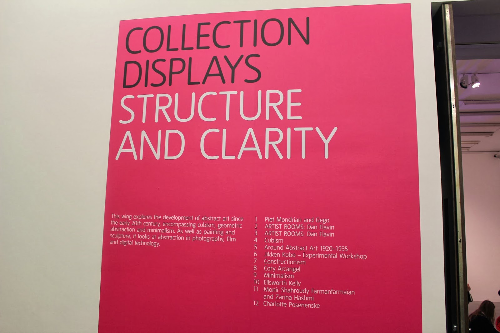
Fig 1. Authors own (clarity and structure ) Tate Modern exhibition
Fig 2. Authors own (Piet Mondrain& Gego)minimalist 1960's
Having the concept of creating minimalistic shapes was such a simple yet powerful idea as they allowed their work to have a strong meaning behind it all. Their approach towards creating abstract forms was to show the relationship between abstraction and the natural world. They wanted the work of minimalism from the earlier years to reflect how we view todays version. There use of primary colours in contract with black and white flows through the work as if it was a painting itself. I admire the change in which they had vision by putting such simple but opposite shaped together to unite as one to address the concept of her view on the art work of organised art and the more chaotic to be united as one.
Fig 3. Authors Own (Piet Mondran and Gego)minimalist art of 1960's
Fig 4. Authors own (Gego)

Styling|Photoshoot concept & Final

 Following from my concept boards my idea and style flows through the inspiration of classic and elegance. My concept of this photo-shoot started off with my photos of self imagery seen as a rose. I used this not only as a prop for my final photo-shoot but as part of me .It symbolises and reflects many things yet it stands alone as one word a "Rose".
Fig 1. Authors own 2013 

fig 2.Authors own 2013 -styling photoshoot