Wednesday 6 November 2013

Final photoshoot


 My final piece inspired by the beauty reflecting from whats in the inside out. I used flowers throughout the concept of "Identity" because it was something that I could use as a symbol of what I felt could look and represent someone. "Beauty is in the eyes of the beholder" this was something i wanted the shoot to come across as. I wanted to look at a way that identifying a person could be seen past there looks and more into depth with the person that you see before the "face" Using props in my shoot of flowers I wanted it to seem as if all the ways she had been identified before was rising out of her transforming her into what she really is . She is slowly moulding into this beautiful piece which explains my idea of using the head piece to cover her face. She's a new person ,more than what society had recognised to be seen as "identity" she is  more than just her looks if you look deeper inside out.

Preview of Final Piece

Fig 1.Authors own-Side profile of garment

fig 2. Authors own- Back view final piece

fig 3. Authors own- Front view of head piece and neck piece

Final Photoshoot| Process of making


During the process of making my Final piece I was able to make several changes before I got to my final decision. The technique that I used was a very quick technique that I liked working with .

Design Development |

Design Development week was my time to experiment quick on our feet a to how to create and develop ideas shapes,patterns with quick sketches which lasted less than five minutes each to draw as many different garment pieces as we could think of and as the end result we would create our own collection which we could visualise people wearing in a/w 2014. We also had an exercise had to use the shape that we cut out from paper and manipulate that design into several different looks depending n the emotion given as our brief. I really enjoyed this as it got us to think more into depth sharp ideas visually using the shapes we had created and how we could transform that into something according to the emotion of fierce,gentle,explosive et....
fig 1. Authors own texture-layering 


Fig 2. Evil -design concept
fig 3.Authors own explosive-concept to design


Fig 4. Authors own Anger-concept for design
Fig 5. (Authors own)  a/w collection 
Creating the final design for my collection had it's own challenges but I managed to get there in the end. Looking at my end result I'm most comfortable with drawing my illustrations more than using photoshop. I want and intend to improve on my drawing skills as I strongly am interested in mastering the key to hand drawn illustration. I found that using photoshop was a struggle for me and it's something that I will be working on as I get through more of the course. My design was originally inspired by the shape which a took from a petal off a rose. I tried to develop each garment by using the curved shape in different places to achieve tie in the whole collection. I wanted my collection for a/w 2014 to be something quite subtle,using light material that I could layer across the necklines to build structure in contract to the rest of the garment.

Knitting Week

fig 4. The row designer aw collection 2013
Fig 1. (Authors own) knitting film 
Authors own - stripes knitting technique

Authors own - Waffle technique

Sister by Sibling a/w 2013 London fashion week
I would have to say that Knitting week was one of the most challenging weeks for me. I had enjoyed the time taken to make several knitting samples and had learnt how time consuming it takes to make a sample using the knitting machine. Overall its was a fun workshop and their was some techniques that I mostly took a liking to such as: Honey Comb and Bubble knitting. I noticed as It was getting further into the week that I was getting the hang of most of the techniques which I was more comfortable with.


Tuesday 5 November 2013

Tate Modern| Structure & Clarity

 Visiting the Tate Modern exhibitions was quite interesting , I viewed all the rooms that was required for me to go to but the Structure and Clarity room had engaged me the most. As soon as you walk into room 9. There are Blocks of colours in different shapes hanged into the walls . There wasn't much going on in this particular room but thats what I liked most about it .I felt this warming and inviting atmosphere which I felt each of the art pieces had given.
Fig 1. Authors own (clarity and structure ) Tate Modern exhibition
Fig 2. Authors own (Piet Mondrain& Gego)minimalist 1960's
Having the concept of creating minimalistic shapes was such a simple yet powerful idea as they allowed their work to have a strong meaning behind it all. Their approach towards creating abstract forms was to show the relationship between abstraction and the natural world. They wanted the work of minimalism from the earlier years to reflect how we view todays version. There use of primary colours in contract with black and white flows through the work as if it was a painting itself. I admire the change in which they had vision by putting such simple but opposite shaped together to unite as one to address the concept of her view on the art work of organised art and the more chaotic to be united as one.
Fig 3. Authors Own (Piet Mondran and Gego)minimalist art of 1960's
Fig 4. Authors own (Gego)

Styling|Photoshoot concept & Final

 Following from my concept boards my idea and style flows through the inspiration of classic and elegance. My concept of this photo-shoot started off with my photos of self imagery seen as a rose. I used this not only as a prop for my final photo-shoot but as part of me .It symbolises and reflects many things yet it stands alone as one word a "Rose".
Fig 1. Authors own 2013 

fig 2.Authors own 2013 -styling photoshoot


Style & Trend | London Fashion Week & Trending board

 London Fashion week had arrived and this was the perfect time to view not only what the designers latest collections were,but street stylers interpritation of the latest trends. This task enlighted me how sales and marketing are brought into brands and one of the things that I had noticed was the layout of the shops from the way the front walldisplays were set,to the hanging racks of clothes within each shop.This was all carefully thought through the process of advertising. Which is what promotion is all about.
 One of the biggest trends falling this Autumn/winter 2013 is the Oversized coats. Myself and other members of my styling group recognised the flow in which elongated and puffed out coats/jackets had taken a big hit in the latest trend and each designer had shown that in an amazing way. We displayed the mood board according to the warm dark tones of blacks,greys and browns in contrast to the more fun and daring bold colours of grey and red and texture of mohair.
fig 2,Authors own (trend mood board) 2013
fig3. Authors own  Tartan print 2013 (trend mood board)                                                                
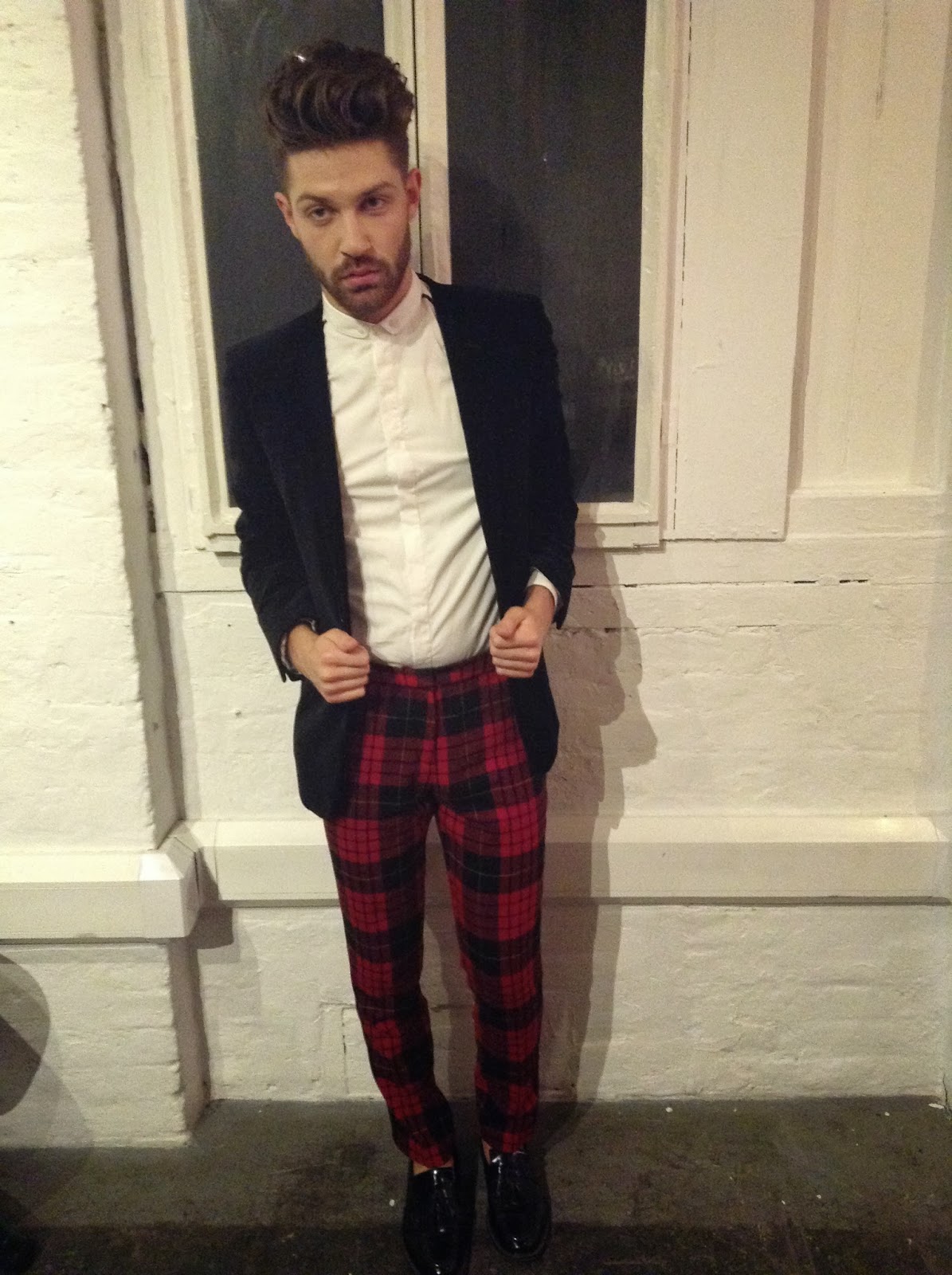
Fig 3.Authors own street style shot Tartan mens skirt 2013- Pause magazine launch party

fig 4.Authors own  street style shot Tartan trend 2013-London Fashion Week Somerset house

It wasn't my intention to take pictures only of the menswear fashion this showed me how the trend "Tartan" can be worn in both male and females.

Style & trend| STYLE DRESS UP!

 Style & Trend week was of the weeks I was mostly looking forward to doing as I enjoy looking into the different styles to what fashion has brought in the past and what is here now. For this week's we was  given the task to look into London fashion week's latest designer collections,street trends and also each others personal style as well. I must say this project had me excited as I love styling myself and others. I also look into styling as part of my hobby from magazine sources to fashion bloggers and also street stylers themselves. Being guided through and seeing an insight into one of my tutors personal styling career and the work,thought and development put into a background stylist's work,it helped me to understand the detail in how I must record each and every part of my vision of how I want something to look not only to me but to my audience as well. I understand that it's important that they can tell my story themselves through there eyes of the shoot.
fig 1. personal accessories (Authors own)2013
Fig 2. (Authors own) student styling 2013
 Using this time to be able to style one another in just under 5 mins wasn't as hard as I thought it would be. I found the exercise to be quite engaging into compromising with using mine and other students props to create quick snap shots. The look which I attempted to pull together was quite classic with the red lip and the big Fur which adds in with my personal choice of dressing.
Fig 3. (Authors own)2013

Fig 4.(Authors own) 2013

Fig 4. (Authors own ) 2013

Accessories Week| Sculpted Chair Design

The object which inspired my design was a tall black metal chair which used to represent an abstract side to my identity. The chair represents my physicality: length-Tall  colour-Black ,Emotion- steel chair- Strong,hard to break down and its use- sitting down (comforting, inviting,helpful) These where part of the words that I came up with when thinking of what and how the chair would reflect my identity and how I could develop from this concept.
Fig 2. Authors own (Accessories chair design a/w 2014
Fig 3. side view experimenting different ways to wear accessories design (Authors own)
                                                 Fig 4. Authors own  mirror reflection effect .(sculpted chair necklace design ,a/w 2014)                                                      Overall I was very pleased with the final outcome of my accessory. There were some challenges that i had with carving the negative spaces out using the stanley Knife but it seemed to turn out ok once I got use to controlling the sharp angles within the shapes . influences taken from the previous designer Irav Van Herpen had a big impact on the way I wanted my design to look,being inspired by the  strong strong seance of structure  and manipulation of layering encouraged me to experiment with the different angles i would place each image .

Accessories Week| Designers

This week was the steeping stone into finally getting practical and creative into the course. I had a fun time this week as it was part of designing which i'm mostly interested in.                                                 At the start of the accessories week we where given the task to look into and update ourself with designers,photographers and stylist, this was a good idea as it helped us look at how the industry is and the different designs and input is required to making NYFW and LFW happen.                      
fig 1.Iris Van Herpen (s/s 2010 collection)
What I fell in love with the most about this designers work was the ability to manipulate  different shapes and patterns within the material used to create something so dramatic and head turning. The designs mole  naturally into the figures as if they are part of the skin instead of being a piece of clothing/accessories which I find quite interesting. Looking at this designer It has broadened my how going into the field of working as an accessories designer can expand with more than just  necklaces ,shoes hats et which I thought was mainly part of garment designers responsibility in making with their collection.                  
fig 2. Iris Van Herpen (a/w collection 2011-2012)
fig 3.Iris Van Herpen 

IDENTITY MOODBOARD


 To start of the project we were asked to create a collage of the objects that we had chosen to represent and reflect myself. The objects that i chose I would say they where  more of the things that I had memory of the past to my present. Looking at my moodboard all together  I can almost imagine a timeline of each event. it helps me to expand on my thoughts,ideas towards taking another step within the breif.

Sunday 20 October 2013

WHO AM I?

Author's own 20.10.2013
 
WHO AM I??? allow me to introduce myself....
 
This is one of the most
 
Identity -noun "the fact of being who or what a person or thing is." For the next few weeks we are given the task to use the brief "identity" to construct ideas and development in different areas of fashion & Textile . This should be an exciting project as we are able to explore into depth how we veiw and reflect on different areas within ourselves. There are seven different areas that we where asked to respond to in our own individual way. physicality,family,history,likes/dislikes,genes,special objects,events,symbol and personality.


  1.